
Client
Team
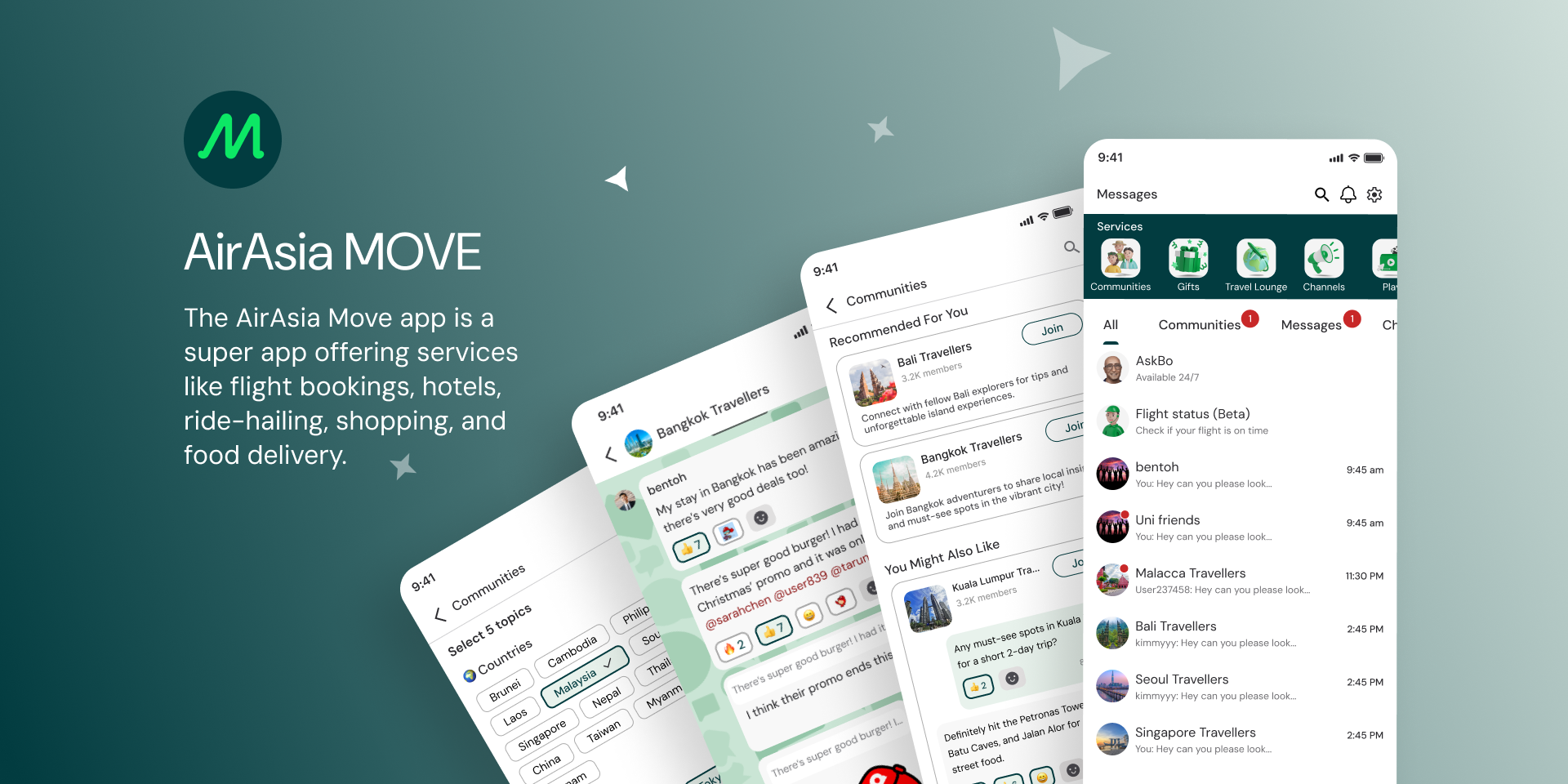
AirAsia MOVE 2024
UX/UI designers (CuriousCore)
UX designer and Product Design Manager (AirAsia MOVE)
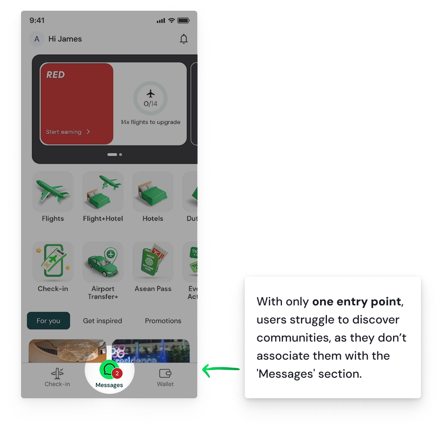
AirAsia MOVE aims to build a vibrant travel community with groups like "Kuala Lumpur Travellers" and "Travel Inspo." Despite having 300k daily active users, only 15k access the community feature, which is hard to discover as it is only accessible via a services tile on the "Messages" page. Limited visibility and unclear value have led to low user engagement, highlighting the need for improvements to increase participation.
How might we increase discoverability and engagement for AirAsia MOVE Communities within the app to create a vibrant space for travelers to connect and share relevant information?
Context
Challenge
My roles
Conducted user research and usability testing to identify pain points and improvement areas.
Introduced new entry points to promote and improve the discoverability of communities, enhancing user interaction.
Organized the Communities page, added features for user content, and implemented guidelines for a safer, engaging environment.
Validated design changes through usability testing and gathered quantitative data on usability improvements.
Project impact
Improved task success rate from 86.67% to 96.67%, reflecting enhanced usability.
Increased System Usability Scale (SUS) score from 57.08 to 83.75, showing a 46.72% improvement in user experience.
Enhanced user engagement with the community feature through better discoverability and interaction points.

UNDERSTANDING
Research
Competitive analysis
To better understand communities and travel apps, we conducted two competitive analyses: one focused on social platforms and the other on travel apps, since AirAsia integrates both aspects.
Social platforms

Key takeaways from competitive analysis
Desk research
AirAsia MOVE currently lacks key elements like emotional engagement and a strong sense of belonging needed for deeper user participation. The diagram highlights these gaps, showing how adopting proven design strategies could improve the community feature.
User interviews and usability testing
Key findings from user research
Travel apps

Navigation and discoverability
Structured categories aid navigation and help users find relevant content more quickly and easily.
Search tools and visually appealing interfaces improve discoverability and create a welcoming experience.
Support and safety
Dedicated chat support helps users find help easily, reduces confusion, builds trust, and improves overall experience.
Introducing clear onboarding and guidelines fosters a safer environment.
Engagement and personalization
Reactions, badges, and rewards promote interaction and loyalty.
Reward systems, personalized suggestions, and verified reviews build user trust and engagement.
Users value the ability to manage notifications for a personalized experience.
Researching the foundations of successful community spaces led me to explore key social psychology concepts, which highlight crucial domains for engagement: social interaction & relationships, usability & onboarding, user motivation, and emotional engagement. Looking at popular platforms like Reddit, which have strong and lasting communities, showed what makes a community product well-designed.

Discoverability
Safety
Engagement and interaction
Affinity mapping with findings from usability testing and interviews
We also validated our hypotheses, aligning them with insights from competitive analysis and research.
Study on social psychology in online communities. Key domains of a community.-
The community domain study provides several valuable insights.
Users are motivated by autonomy, competence, and relatedness. To encourage participation, communities should offer:
Freedom to contribute in various ways.
Opportunities to showcase knowledge and skills.
Supportive, empathetic interactions to foster emotional connections.
Clear communication and positive reinforcement to build trust.
Community success relies on strong social interactions, which help form emotional bonds and trust. A balance between weak and strong ties promotes both information sharing and emotional support.
Timely feedback shows that user contributions are valued. Interactive features should create seamless, immersive experiences, enhancing user engagement and promoting flow.
Successful online communities have three key components:
Shared purpose
Social interaction
Policies
To create a sense of belonging, online communities should integrate rich communication, emotional engagement, and self-presentation opportunities. Affective design helps users feel more connected and invested in the community.
Smooth onboarding and adaptable designs encourage long-term engagement. Users are more likely to participate if the platform is easy to use and fosters a sense of belonging.
Sources:
Rafaeli, S., & Te'eni, D. (2001). The Psychology of Online Communities: A Review. Communication Research , 28(1), 61-98
Howard, T. W. (2010). The Nature of the Beasts. Design to Thrive, 11-27
Shen, K. & Khalifa, M. 2009, 'Design for social presence in online communities: a multidimensional approach', AIS Transactions on Human-Computer Interaction, vol. 1, no. 2, pp. 33-54
To evaluate the effectiveness of the current community features in the AirAsia MOVE app, we conducted a round of interviews combined with usability testing. Our main objectives were to understand how users discover, join and engage with Communities and to pinpoint specific areas for improvement.
-
Objectives 🎯
To understand how users currently discover, join and engage with Communities in the AirAsia Move app and identify opportunities to improve these processes.Hypotheses 🤔
- Users lack a clear understanding of the value of joining communities.
- Community discovery is not intuitive and lacks tools for user-generated content and interaction.
- Too many communities without a filter option causes decision fatigue.Target audience 👥
- Travel app users
- Lifestyle superapp usersMetrics 📈
- SUS (system usability scale)
- Task success rateKey tasks 📝
- Finding the communities section
- Browsing content
- Joining a community
- Engaging with postsFollow up questions❓
To understand their experience, what features they found useful and where they encountered difficulties.Total participants: 12 (6 for each round)
Based in:
Singapore
Taiwan
Japan
Malaysia
United StatesAge range:
3 users 18-24
7 users 25-34
2 users 35-44Devices 📱
iOS (iPhone)
AndroidTech savviness 💻
1 user Basic (Limited experience with apps)
8 users Intermediate (Regular app user)
3 users Advanced (Comfortable with all features and navigation)Travel frequency ✈️
3 users Frequently (Monthly or more)
7 users Occasionally (1-2 times a year)
2 users Rarely (Less than once a year)Online communities (forums, social groups, etc.) engagement 💬
5 users Actively (Regularly posts, comments, and engages)
7 users Passively (Reads but rarely posts or comments)
Through usability testing and interviews, we noticed recurring themes in user behavior and feedback. We consolidated these findings into three key problem areas:
DESIGN SOLUTIONS
Multiple entry points to promote Communities
Problem
During the kickoff meeting, the client emphasized the need for ideas to attract users to communities, explore entry points, educate users, and determine the best timing and placement to recommend joining.
This aligned with findings from usability testing, where users struggled to discover the Communities feature due to limited entry points and unclear navigation.
Solution
To address this, we introduced multiple entry points to increase visibility and accessibility of the Communities feature.
CURRENT DESIGN
Homepage. Tab bar
ENTRY POINT SUGGESTION 1
Homepage. Trending communities section

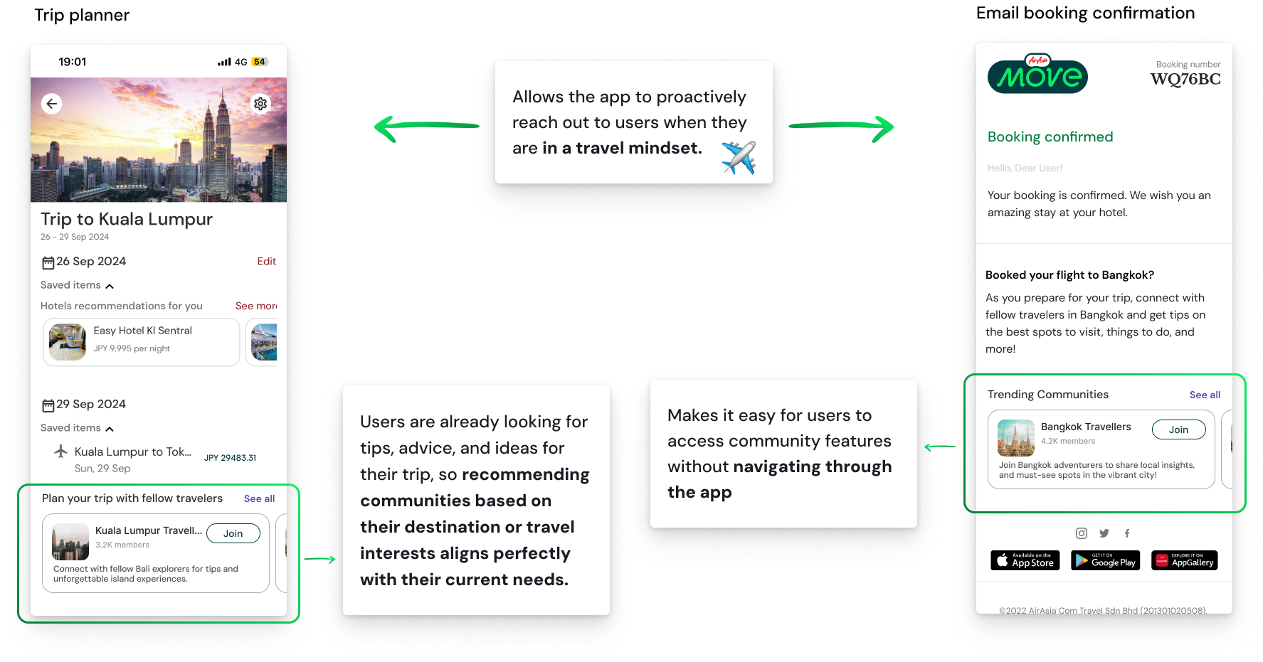
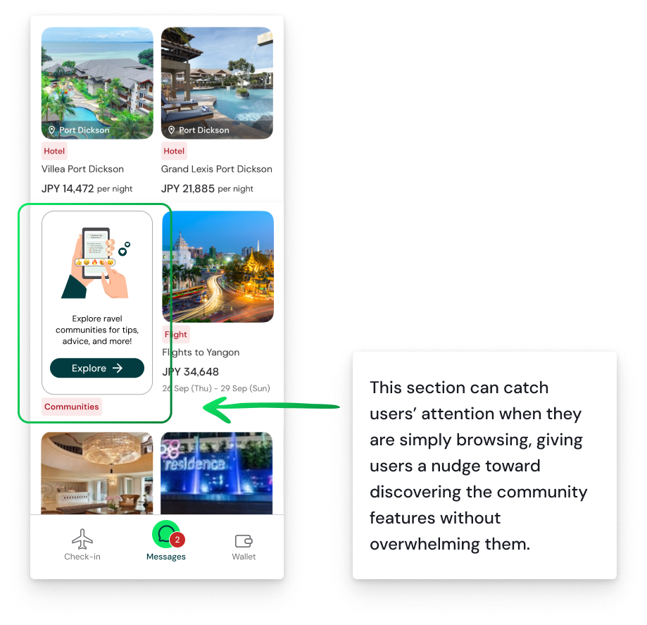
I added entry points in moments when users are in a discovery mindset like the “Get Inspired” section and post-booking emails to naturally guide them toward communities.
ENTRY POINT 3
Homepage. Get Inspired section

ENTRY POINT 4
Leveraging geolocation

ENTRY POINT 5
Planning your trip
ENTRY POINT 6
Post trip engagement

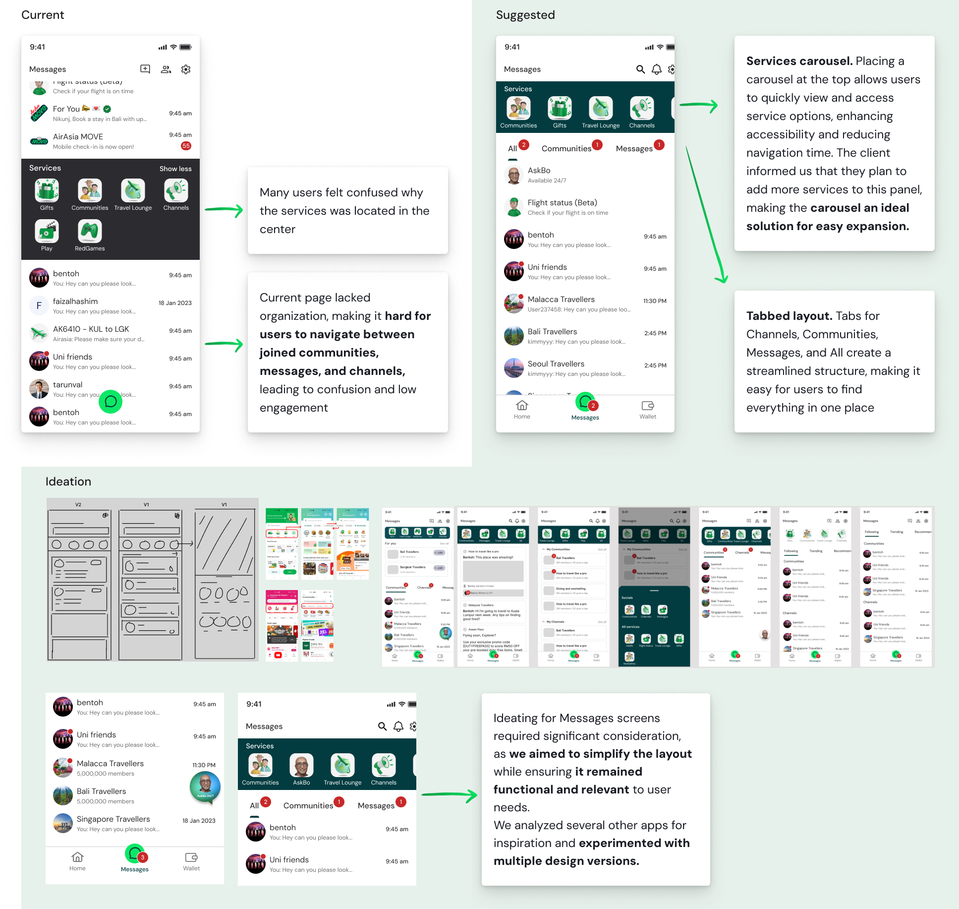
Organized Messages page
Problem
Users found the Messages page cluttered and difficult to navigate, which hindered their ability to participate in conversations within communities. This lack of organization negatively impacted user engagement.
Solution
We introduced a reorganization of the Messages feature, ensuring it was easy to navigate.
ENTRY POINT 2
Homepage. A banner that communicates the value of communities, with a CTA guiding users to explore and join
Improving search and personalization
Problem
Users struggled to find specific communities due to the lack of a search bar and felt the Communities page lacked personalization.
Solution
Introduced a search bar on the Communities page to allow users to easily search for specific communities by keywords or topics, addressing the lack of discoverability.
Proposed preference selection, allowing users to pick five topics to curate personalized community recommendations.

Enhancing safety and moderation
Problem
Users felt unsafe due to excessive spam and inappropriate content in community chats. The lack of moderation discouraged engagement, and some users joined communities in search of support because they couldn’t find help elsewhere.
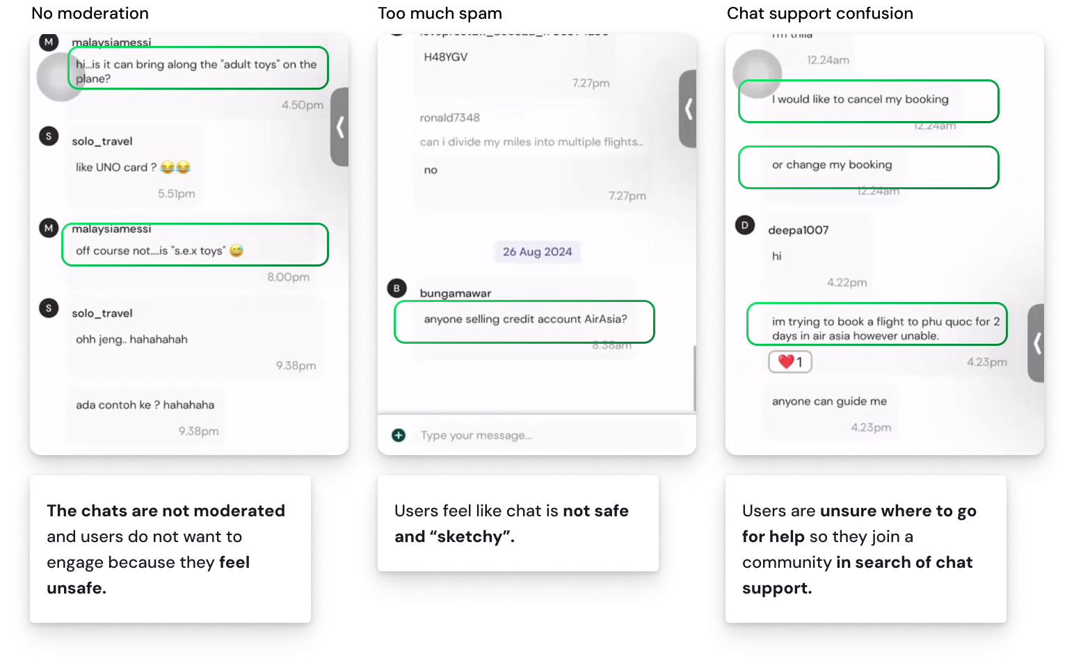
Solution
Add moderation tools to filter spam and inappropriate content.
Introduce community guidelines to promote safer interactions.
Improve visibility of official support channels to reduce reliance on community chats.
